Style forms in the theme editor
Maxsight allows you to add your custom CSS styles to the form to create a seamless, branded experience for your customers when they complete your request for additional documentation or registration details.
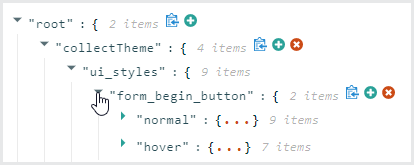
There are two panes in the theme editor. There is a preview pane on one side and a configuration pane on the other side. Once you commit a change in the configuration pane using CSS properties, it is reflected in the preview pane immediately so that you can see your changes as soon as you make them.
When you are finished making the changes, copy the style code and send it to the Maxsight support team.
Note that Maxsight does not support custom fonts. Use web-safe fonts or the appropriate CSS font fallbacks.
To edit a style option:
Use the drop-down arrows to find the style that you want to edit.

Hover over the style you want to edit, then click the edit icon
 .
.Make your changes in the grey box and click the green tick icon. You'll see your changes in the form immediately.
To copy a change from one style to another, click the copy to Clipboard icon  and make your changes using steps one to three, or click the remove icon
  to remove that style altogether.
Use your browser's refresh button to reset your styles.
The style options in ui_styles include:
CSS property | Description |
|---|---|
| Style the buttons that appear on the first page of the form, such as . |
| Set the style for the buttons shown in the form. This includes the button as well as the and upload file buttons. |
| Set the style for buttons. |
| Set the styles for the free text fields and other user interface elements without a specific class assigned to them. |
| Style your header logo. You can set the size and padding in pixels (px) and percentages (%). |
| Set the background shaded color for questions that use radio buttons, or Boolean questions. |
| Set the styles for drop-down questions. You can style the color and font entries. |
| Style the Need help? text, including the drop-down arrow. You can style the color and font entries. |
Edit the color styles to change the overall color scheme of the text shown in the form, such as the field labels, the *required text and hint text that appears after a field if a user needs assistance.
Edit the content styles to change social media links and settings.
Edit the global styles to change various universal settings, such as font size for headings.
Not all CSS properties are supported, so we recommend that you use the existing styles.
To learn more about customer request customization, read our Customer communication integration guides.
Once you are done making your changes to the styles, click the copy icon at the root and then paste the code into a TXT file in order to raise a change request.
